A disability service located on the Northern Beaches of Sydney, Beaches Care’s approach to support stood out from others in the sector. They believe that support workers should embody more of a friend than a worker – the setting should be fun and adventurous, not clinical.
Beaches Care needed a brand. Full stop. They required a full logo suite, email assets, colour palette, typographic system, imagery, a website, printed merchandise, brand guidelines and continuous social media management and content production.
Their mission statement:
A support network built on mateship.
Project Scope

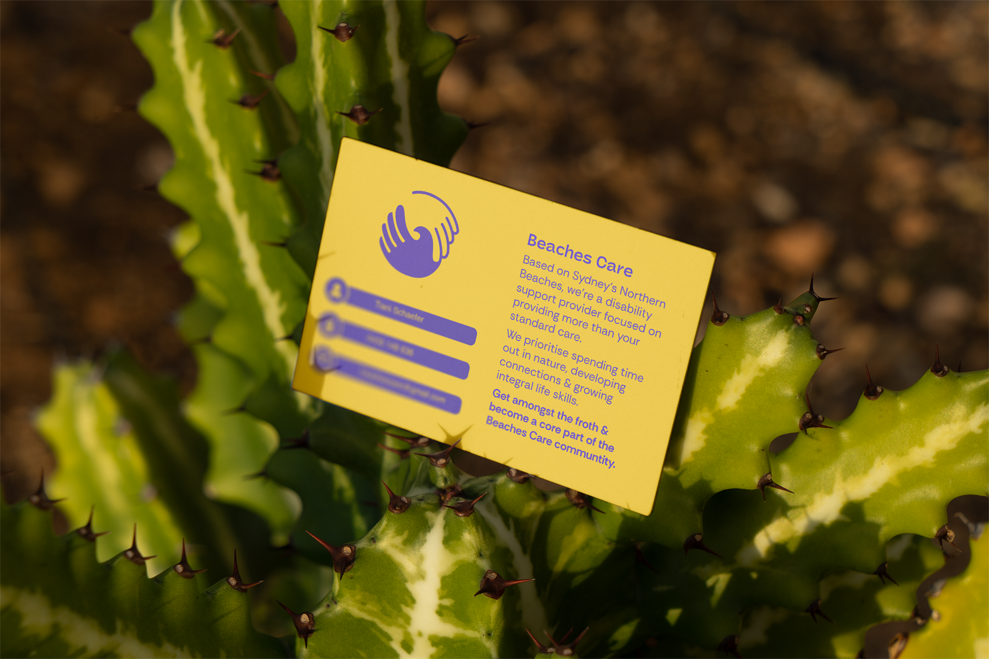
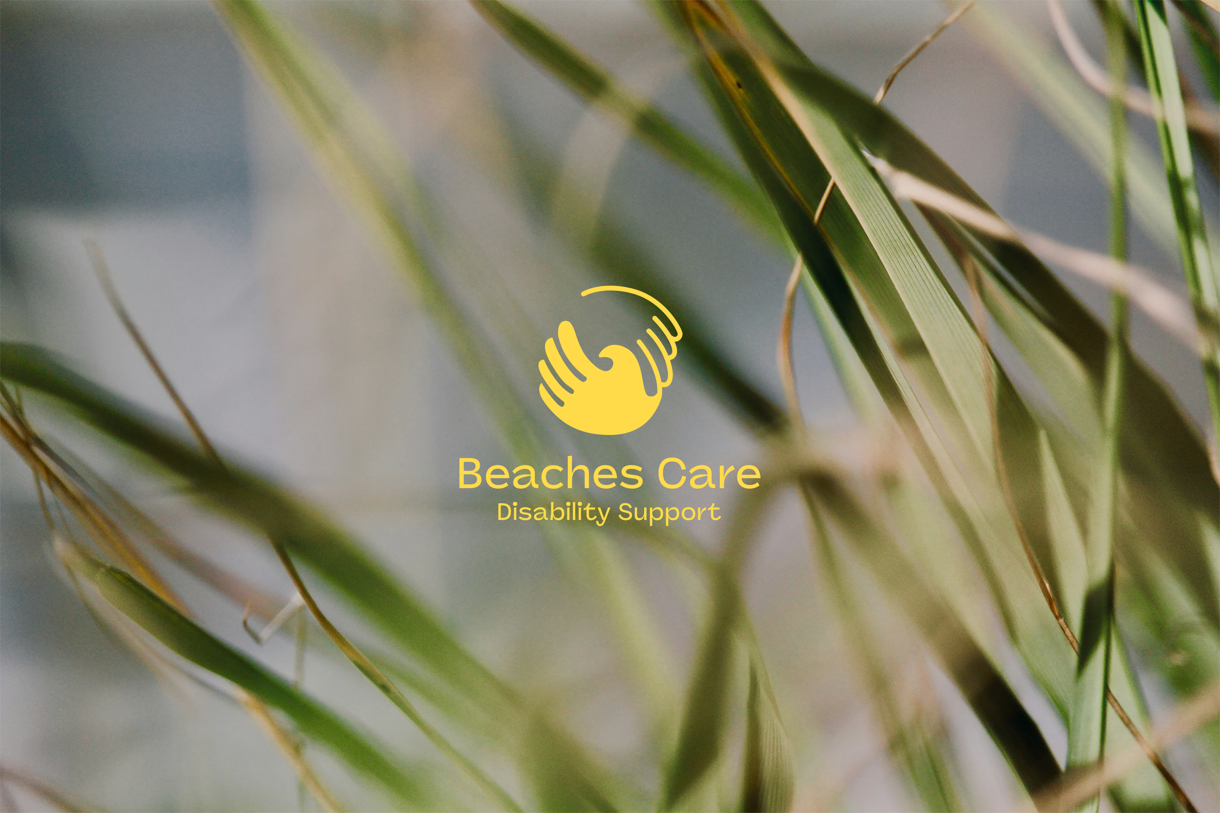
Behind the Logo
Interconnected hands represent connection, care and friendship. A wave replaces the thumb as a nod to the culture embedded into the Northern Beaches community. Bright, bold and complementary colours reflect the business’s friendly and playful personality.