Your down-to-earth lawn carer.
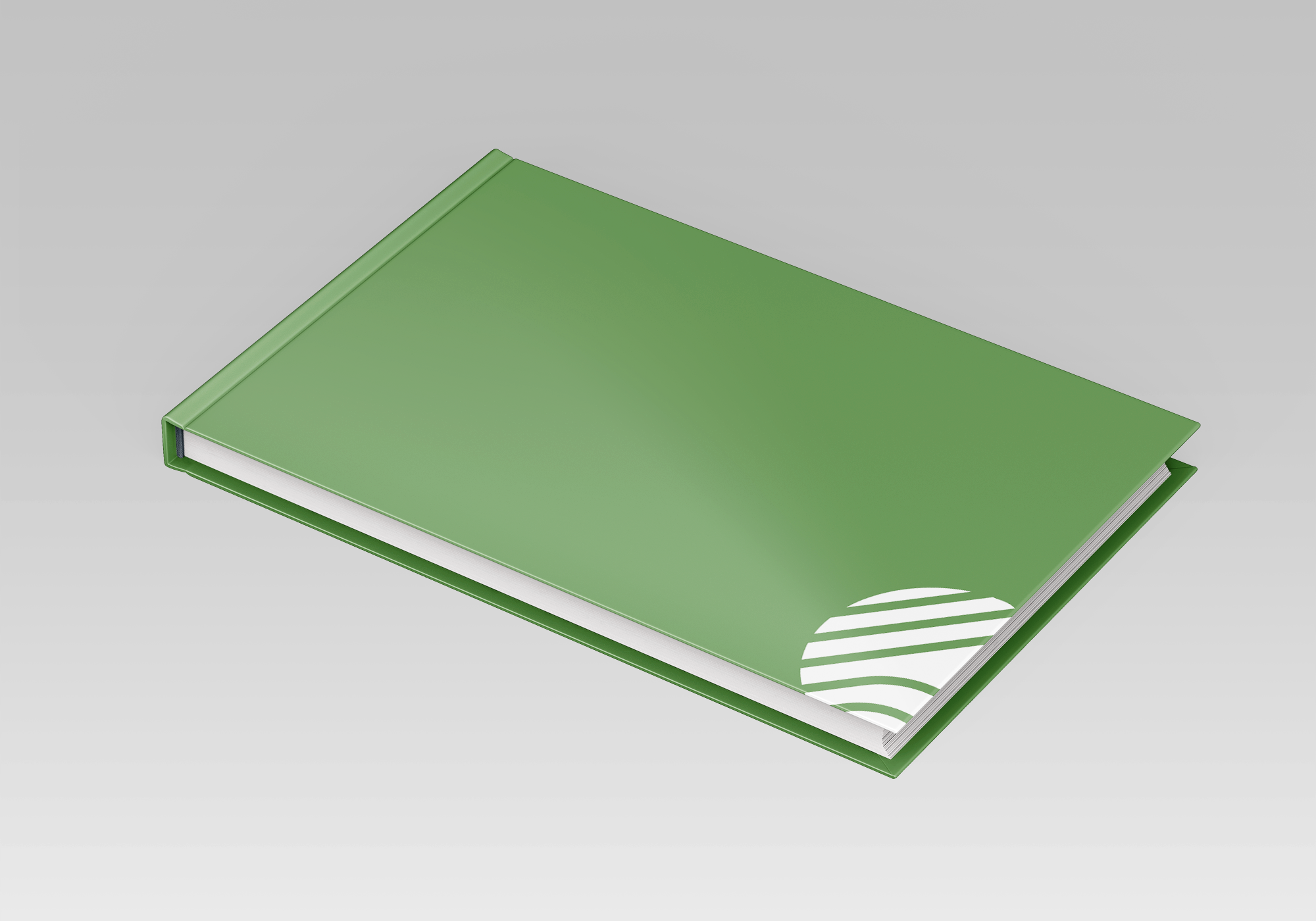
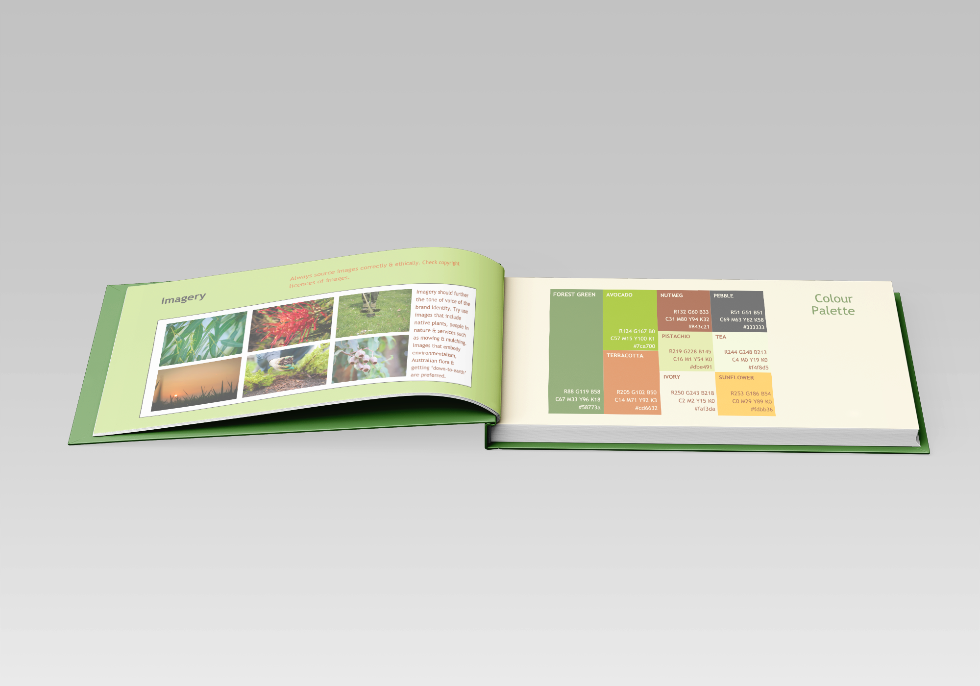
Kai (founder of Ku-ring-gai Mowing) required a brand identity, logo designs, emailing assets, print-ready merchandise designs, templates for widespread digital and print application as well as a set of guidelines to implement the branding himself.
All design collateral was inspired by Kai's extremely down-to-earth (mowing pun-intended) and genuine nature, as well as the organic core of the company's values. Kai uses only natural ingredients in his gardening, mowing, mulching and landscaping services.
Project Scope
Behind the Logo
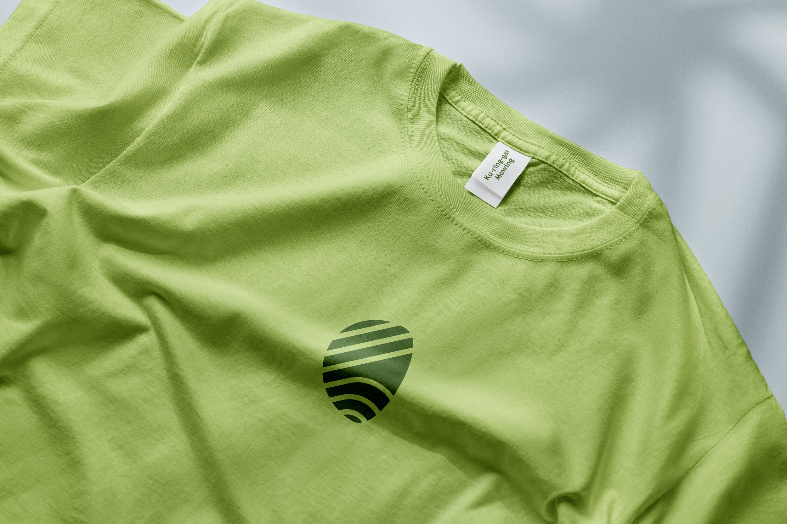
The shape of the logo’s symbol reflects the organic nature of the environment and Ku-ring-gai Mowing’s ecological values. The choice of a forest green hue hints to the services provided by the company and imitates nature.
The lines cut out of the logo’s symbol mimic the grass lines formed by a lawnmower while also creating an abstract ‘K’ – the first letter of both ‘Kai’ and ‘Ku-ring-gai’.